Our recent kitchen remodel lasted 6 months. 6 looong months. During the summer, our 8 year old son would walk in the door after a busy day at his summer program and announce, "Ahhh...home unfinished home!" We survived though (and stayed married) and are ready to tell you all about it.
This one was different. Overwhelmingly, alarmingly, surprisingly, all the -ly'ies different. Like as in, if I knew now what this would have involved, I may have been too scared to tackle this one. Of course we are thrilled with the outcome and glad we bit the bullet, but this remodel was no easy feat.
We weren't prepared for how quickly a kitchen remodel can spiral into each adjoining room. What started out as..."Let's take out the wall between the kitchen and the dining to make it feel more open!" quickly turned into "MIGHT AS WELL DO _____________, TOO!" Beware that this is the most dangerous and expensive phrase in a remodeling scenario.
BEFORE
We'll start at the beginning. The wall in the photo below was our biggest problem. The kitchen was completely closed off from the dining area because of the small door frame constricting the space.

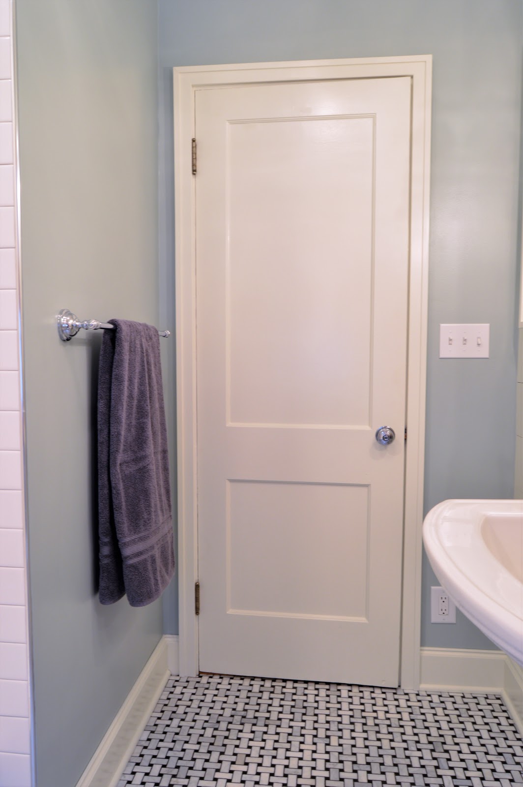
The white door leads to an upstairs bedroom and we typically leave it open for air flow. Except when it's open, its only impedes the traffic coming to and from the kitchen.

The stove was in a terrible position, right against the wall, which made it difficult to use the two burners on the left.

On the other side, the fridge was right in the middle of the room, making a narrow kitchen feel even more narrow. With the fridge door open, no one could pass by because of the door swing. The large pantry cabinet was great, but I would take counter space over cabinet space any day.

The old kitchen had just one heat/cooling vent and pair that with small door frames, it would heat up pretty quickly without the ability to circulate air through it.

And although I love, love, loved that dining room light fixture, I could rarely center the table under it because our dining area is a pass through and centering the table makes it difficult to walk around. I wanted to remove the light fixture and replace with recessed lights so I wouldn't have to call more attention to an off centered dining table.
Fast forward to today and things are feeling much lighter and brighter! What once was a galley kitchen is now completely open to the dining area and can handle multiple cooks at once. I spent many months drawing out the kitchen of my dreams on graph paper and it has been so gratifying to see it take shape.
AFTER
Fast forward to today and things are feeling much lighter and brighter! What once was a galley kitchen is now completely open to the dining area and can handle multiple cooks at once. I spent many months drawing out the kitchen of my dreams on graph paper and it has been so gratifying to see it take shape.

Removing the wall between the rooms has unified the main living areas. Opening up the stairwell has helped, too. We raised the height of the stairwell door a few inches to make it easier to move furniture to the 2nd floor.

I purposefully staggered all of the appliances so that if I were at the stove and Brent was doing dishes (are you getting the hint, Brent??), we wouldn't be standing directly back to back. I considered centering the stove on this wall to make the wall of cabinets feel more symmetrical, but that would have meant the dishwasher would be directly in front oven. No good because there are usually two of us working in here at once. More than anything in this new kitchen, I wanted a long stretch of counter top to spread out on. In the old kitchen, I would have to work in three separate areas because not one of the three areas was enough to accommodate all my bowls/ingredients. Planning a kitchen layout really makes you reflect on HOW you cook.

Look at the two photos above. Notice anything missing? Outlets? Switches? They are all under the cabinets!!! Brent used toggle switches for the under cabinet lights and the light above the sink. I love that there aren't any outlets cluttering up that gorgeous backsplash!
The counter tops are quartz, that we went with because of their durability and require zero maintenance. Love them and can't say enough good things about them. And bonus, since our kitchen is pretty small and doesn't have any corner seams, we were able to get a remnant slab for half price!
The photo below is the view when you walk in from our garage door into the kitchen. We put the pull out pantry between the fridge and the wall so that the fridge door can swing all the way open, allowing us to get drawers/trays out for cleaning. We built the fridge cabinet to accommodate a 36" wide counter depth fridge, but we're waiting to pull the trigger on a new refrigerator because our current fridge is working just fine. TIP: We used a recessed electrical outlet for the fridge and the stove so that they can slide as far back as possible to the wall.


I love that view into the dining room! I used to be so closed off in our old kitchen, having a conversation with someone at the dinner table while I'm in the kitchen has made the biggest difference. For most families, life happens at the dinner table and now I can actually see it!

Let's chat about this sink. When the salesperson was over and looking over our plans, she asked what type of sink I was going to use. I knew a white farmhouse sink wouldn't be a good fit because I was afraid of the maintenance and I wasn't thrilled with the idea of a bright white sink against warm white cabinetry, so I assumed stainless steel was my only option. She mentioned how stainless scratches quite easily and that I should look into a quartz sink. BEST DECISION EVER! This thing has been indestructible. I love the color, it's a matte black/charcoal and extra deep. The drain is offset so I don't have to push the dishes to either side to find the drain. And having an undermount sink is a life changer. Since we do so much prep on the counter tops next to the sink, sweeping crumbs into the sink has been a dream. The matte black faucet swivels, pulls down and out and has two spray settings. Love.

Increasing the size of the window has given us a better view of the backyard and it lets so much light into the kitchen!
Side note: the drawer in front of the sink tips out to reveal two storage containers for sponges and a switch for the garbage disposal. Brent even used a special switch for the disposal that you have to hold down to operate, so when you take pressure off the switch, the disposal turns off.
Side note: the drawer in front of the sink tips out to reveal two storage containers for sponges and a switch for the garbage disposal. Brent even used a special switch for the disposal that you have to hold down to operate, so when you take pressure off the switch, the disposal turns off.

As for the backsplash, from the beginning, I had planned to do a classic white subway tile but I couldn't pull the trigger because the subway tile was a bright white and our cabinets are a warm white. I didn't want the cabinets to feel too creamy, so we needed to find a white backsplash tile that had a warmer tone to it. You can see the subtle differences below and why I went with the arabesque pattern.


Switching gears to hardware, this one took an embarrassing amount of time to nail down. I knew I wanted the little glass like knobs on top because they seemed to match our house. But choosing the hardware for the lower cabinets was torturous! We needed two different sizes, a longer length for the large drawers and a shorter length for the doors and small drawers. We finally found this hardware from Amerock called Rochdale and it was perfect.


The biggest surprise in the remodel came in the form of hardwood flooring. Years ago, we salvaged matching hardwoods from a friends house, knowing that someday we'd put them in the kitchen. When we remodeled our bathroom, we learned our existing floors were only 3/8 thick. The flooring we had salvaged was the right width but 3/4 thick. Our existing hardwoods are very difficult to find and if you can find them, can be pretty expensive so tile was going to be our second choice. The thought of having a transition between the kitchen and dining kept nagging me because I knew it would interrupt the flow of the house. At the last minute, I begged Brent to take a look at the hardwood flooring to see if he could make it work. He ended up running every single strip of reclaimed flooring through the table saw to get it to the correct width. Twice. Once on each side to shave it down. Then he ran each strip through a planer to get them to approximately the same thickness. That did the trick and after some belt sanding we were able to get the floor laid perfectly level with the existing flooring.

Unfortunately, that was the easy part. Next we stained the floor with the color Spring Oak and applied 4 coats of oil based poly. Problem was, we couldn't just poly the kitchen floor or the existing floor would have a different type of sheen. In order for this to feel right, we were going to need to screen and re coat ALL the hardwoods on the main floor. We pulled all the trim from the bedrooms (we were going to be replacing it anyways) and cleared out the furniture. Next I scrubbed every inch of the flooring with dish soap and water and a green scrubby pad. As it dried, Brent came behind me with a screening pad attached to a pole sander. He used a fair amount of elbow grease because you really want to scratch that top surface of existing polyurethane. Then we vacuumed the dust, wiped everything down with mineral spirits and applied two coats of oil based polyurethane called Fabulon in a satin finish with a lambswool applicator. As long and arduous as that process was, it was totally worth it! It feels like we have brand new floors. No more little scratches from the dogs nails, they are just as smooth as glass! Apparently if you have hardwoods laid in place like we do, doing this screen and re-coat process every 5 years or so will really extend the life of your hardwoods. In the photo below, it's pretty tough to tell where the old floor and new floor meet.

In the photo above, you can see a heating/cooling vent that we cut into the toe kick of the base unit. We also added another one at the opposite end of the room to improve the air flow.

Ahhhh...this table! We got lucky and picked up a Magnolia Home farmhouse table for half price at Hom Furniture. Pier 1 sells an 8' version on their website.

The dining room used to have a chair rail that was original to the house. Removing it meant a really noticeable paint line. The best way to fix that was to skim coat all the walls in the dining area. That means applying a full coat of joint compound to the entire room. When I step back and look at before/after pictures, it looks like we simply painted the wall. Before and after photos can't fully encompass the scope of work and effort it took to do a job correctly in order to end up with a high quality result.

Tutorial for the family photo display can be found HERE.

But the real bread and butter of this remodel is THE CABINETRY!!! Until this point in my life, I really thought the only options for purchasing affordable cabinets were through the big box retailers. We'd gone that route before and had good luck. However, I didn't know what I was missing. Our cabinets are from Sioux Falls Kitchen and Bath (for those of you in SE South Dakota, NW Iowa and SW Minnesota) and here are a few things I've learned with my first custom cabinet experience.

1. They send a salesperson to your house to look at the space and give you options and ideas to utilize every single square inch of the kitchen and tweak the layout if they see issues. Most of us will get to design one or two kitchens in a lifetime, do yourself a favor and call in the experts because they have so many years worth of experience to apply to your space!
2. Custom cabinets don't require fillers since everything can be made to the exact size you want. When you purchase from a big box store, they will only have standard sizes available (unless you upgrade and spend more $$$) and they send fillers to fill in the gaps.

3. The salesperson will know what types of options exist for storage. I had been contemplating a dish drawer and it was so helpful to talk to someone that could tell me whether or not they were a good idea. Below is our pull out pantry. I had never even seen this type of unit before so would have never known this was available!

I picked up a bunch of these little metal baskets in silver and black from Wal-Mart and they fit perfectly in the pull out!

4. High quality hardware comes standard with all Sioux Falls Kitchen and Bath cabinets. This means every single drawer, door and pullout is a slow close and all drawers and slide outs are on full extension slides so you can get to the back of the drawer.
5. The ability to have doors and drawers replaced, if they become damaged, gives me the biggest sense of relief. I can't imagine how difficult that would be to accomplish if you order your cabinets from a big box retailer that ships their cabinets in from five states away. And what if it's three years later and they don't even sell your particular cabinets in your particular color anymore?

6. You get to choose ANY color - yessss!!!! For some people, having limitless choices on a cabinet color could be too overwhelming. I knew that I wanted White Dove by Benjamin Moore. Sioux Falls Kitchen and Bath works with Sherwin Williams paint but can color match to whatever you like. I LOVE LOVE LOVE that our cabinet color matches all the trim, crown and doors in our house. If we had to go with a stock white cabinet, I'm not convinced it would feel as cohesive.
7. You get more options! Look at the matching panels on the upper and lower cabinets. Normally you'd see a flat panel there but I love that we got to add this beautiful detail. There are also many more door styles to choose from depending on your taste.

8. Custom cabinet shops offer more than just cabinets. We also purchased all of our crown molding for the kitchen, dining and living room, door trim for the entire main floor and base trim for the whole main floor through Sioux Falls Kitchen and Bath. In the photo above, you can see the new crown at the ceiling and new base trim that Brent wrapped around the base of the fireplace.
9. Our salesperson coordinated the counter top installation for us. All we had to do was pick out the slab and she took care of the installation scheduling and invoicing. This was a great benefit as we have never purchased stone tops so we weren't familiar with the templating and installation process.

10. And the bottom line - custom cabinets can be affordable! If you're in the market for cabinets, make sure you get a quote from SF Kitchen and Bath or whatever custom cabinet builder is in your neck of the woods. I think you're going to be pleasantly surprised to find high quality custom cabinets with luxury upgrades are going to be comparable in price with the home improvement stores.
Sources - click for links
Cabinet, trim, crown color - Benjamin Moore White Dove
Wall color - Benjamin Moore Revere Pewter
Cabinets - Sioux Falls Kitchen and Bath
Countertops - Hanstone Quartz color is Pewter
Upper cabinet hardware - Hickory Hardware Crystal Palace
Lower cabinet hardware - Amerock Rochdale pulls in 2 different sizes
Undermount sink - Karran undermount black
Backsplash tile - Mohawk Glasen Stone White Arabesque
Backsplash grout - TEC Power Grout in Silverado
Sconce above sink - Joss and Main Lana 1-light wall sconce
Dining table - Magnolia Home Turned Leg Dining Table - 7'
Living room rug - Joss and Main Bernard Light Gray Area Rug (9x12)
White fur ottomans - Bed Bath and Beyond Idea Nuovo Mongolian Ottoman