Saturday, April 30, 2016

Industrial Floating Shelves

About a year ago, this is what our children's bedroom looked like.  Then Brent and I bought a California King bed (BTW it's AMAZING!) and it shook up the whole household.  Living with a queen size wasn't working for us anymore - snuggling with four people to watch a movie or read nighttime books was getting a little tight, which was the reason for the upgrade. We knew that with the purchase of that large bed meant Brent and I would need to relocate our master bedroom to the second floor to accommodate such a large bed.  After we moved upstairs, that left two bedrooms on the main floor, one for each kid.  
Problem is, they still prefer to sleep in the same room, so we moved both of them to the back bedroom and this front bedroom became their "playroom."  Which sounded great at first - WOW - a dedicated room to hold all of their toys!  But that soon spiraled into OMG - I can't even walk in this room because EVERY TOY IN THE HOUSE IS IN HERE!
After a year, we decided to split up their bunk beds and turn the front bedroom back into Owen's room.  This coincided with Emma's 9th birthday, and knowing the kids would probably still like to sleep in the same room together, Brent built the Ana White Farmhouse bed for her room in a full size.
I painted it with Benjamin Moore Hale Navy and our daughter is in love with it.  The other added bonus of putting this full size bed in her room means we sort of have a guest room should we need it. After finishing that bed project, I turned my attention back to Owen's new room.
I removed the heavy fabric curtains to make the windows look larger, but still needed a simple way to block out the light.  Home Depot sells cordless cellular blinds at a pretty reasonable price and they mount inside of the window frame for a clean look.  The walls got a fresh coat of paint in Benjamin Moore Revere Pewter and the ceiling, trim, doors and built-ins are Benjamin Moore White Dove.  The bed in this room is one of the bunk beds.  Brent made caps to go on the top of the bed posts and I painted it with Hale Navy.

Although all of the large windows let in a lot of natural light, evening time is a different story.  He only has one overhead ceiling fan light in his room which was doesn't put off much light.  I didn't want to mess with floor lamps so we hung a set of outdoor lights from Costco by hooks in the ceiling.  The plug in behind the bedroom door so you don't see the cord.  At night, it's beautiful in this room because of the warm light they emit.

Now onto the real project here!  I'd been dreaming of floating shelves to mount on either side of his window to hold his books, Lego creations and whatever else it is that boys like to put on shelves.

Brent began by building 4 of these shelves.
I sanded them and applied a coat of this Minwax Pre-Stain Wood Conditioner.  It allows the wood to absorb the stain more evenly.
Next came a coat of American Walnut stain.


And then for a little change of pace - I put a coat of weathered gray stain over top of the walnut to tone it down a bit.
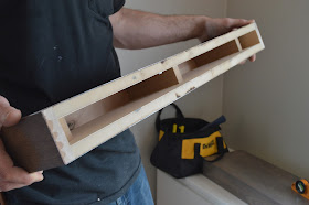
Here's what the floating shelves look like from the back.
Brent mounted the wood support to the wall and then slides the floating shelf into it.
The make these shelves a little more interesting, we 8 sets of this hardware from the home improvement store.
We spray painted all of the hard ware with this black textured Rust-Oleum spray paint.
Here's what my spray painting station looked like:
After everything was dry, Brent drilled two holes toward the front of the shelf, put the turnbuckle through the U-Shaped hardware and then bolted it underneath.
The last step was to hook the other end of the turnbuckle onto this hook piece of hardware and screw it to the wall.  This hardware isn't actually supporting any of the weight of the shelf, so we didn't use any special anchors in the wall plate.
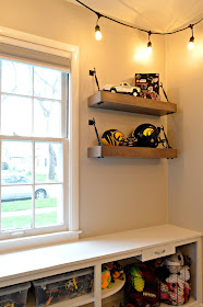
And here's the finished shelving.
This is what his room looks like today - well - correction, it only looks this clean when I'm ready to take pictures.  There are likely Lego's all over the floor in their now, the bed is no longer made and the books spread about.  But whatever, at least it looked good for a few solid minutes.

The floor rug was a last minute addition.  I ordered it from Costco.com to the tune of $100!  And it's a 8x10 rug that's soft and cozy - you can't beat that price!

Wednesday, April 27, 2016

Kitchen Remodel

Some time ago, my sister and her husband, who live about 4 hours away from us, started dreaming of a new kitchen.  You can see in the photos below that their kitchen was difficult to work in and not a joyful place to be.  The refrigerator blocked the doorway that leads to the basement and to their exterior.  An old, unused chimney was taking up valuable space and the stove top was pressed against a wall, making it very difficult to put pans on half of the burners.

Planning for a full kitchen remodel is a long and daunting task.  Trying to keep within a reasonable budget but also creating a dream kitchen is a difficult balance to strike.  I can easily say it took months and months of planning and sketching to figure out what we were going to do with this space. Luckily my Dad has done plenty of kitchen remodels so working alongside him and learning from a seasoned pro was a great experience.

To begin with, my Brother-in-law and his dad removed a chimney that ran alongside the right side of the stove.  With the chimney out of the way, the refrigerator was moved to the opposite side of the room so that it wouldn't protrude into the doorway.  And then their kitchen stayed in that state for a few months until we could decide how to proceed.

 We removed the soffit above the space where the refrigerator was to make room for 42" cabinets.  Recessed lighting replaced the old fluorescent fixture.
Choosing a cabinet color was the trickiest part of this process.  My sister and brother-in-law were torn between choosing a "safe" cabinet finish that would be the best choice for re-sale down the line OR do they choose a finish that appealed most to their taste.  I finally asked my sister what type of kitchens she was most drawn to when browsing Pinterest.  A quick look at her dream kitchen Pinterest board pointed towards gray cabinetry.

After checking around the local home improvement stores, they settled on American Woodmark Cabinets sold by Home Depot.  The paint color they chose is called Stone and the door style is called Reading.  Removing the soffit allowed us to have all of the cabinets in the kitchen go to the ceiling, whereas before, we were dealing with two different heights.

We chose to add this pantry cupboard where the fridge used to be to give them additional food storage.  Just to the left of the pantry on the bottom set of cabinets is a pull out trash cupboard - which is essential for a small kitchen with a dog and a toddler.  You can't afford to lose valuable floor space with a trash can, and this pull out cupboard is great because it has two trash cans in it.  One for trash and one for recyclables.

This sink was somewhat of a debacle.  In the original kitchen, there was a very teeny tiny dishwasher, so compact that it barely held anything so my sister and brother-in-law just removed it to make way for a trash can.  It was easier to wash dishes by hand than to load such a tiny dishwasher.  But in their new kitchen, they really wanted and needed a dishwasher because they have a three person household now instead of two.  The length of this wall is just a little too short to accommodate a dishwasher and a standard sink base cabinet.  So we ordered a smaller sink base cabinet and a single basin (but VERY deep) sink.  We were afraid the sink was going to look out of place because it was going to be impossible to center it under the kitchen window.  But it worked out that the right edge of the sink lined up with the right side of the window!  And since the faucet is set into the back right hand corner of the sink, it drew less attention to the fact that the sink was centered under the window.  We could have avoided the problem by putting the dishwasher in the set of set of cabinets to the right of the window, but that would have meant turning around to load the dishwasher, which sounds like a disaster in my book!

That little space to the right of the sink base unit was just going to be a dead space covered by filler, but my dad said we could trim it out to create a small space to put cutting boards or cookie sheets/cooling racks, etc.  I'm glad we went ahead with that plan to give them a place to keep those awkward size items.

Here you can see that we shifted the stove about 30" to the left of where it used to be.  This created a countertop on both sides of the stovetop for more convenience when cooking.  The refrigerator is tough to see but it's to the far right.

Under cabinet lighting was easy to install as you simply plug in a transformer to an outlet inside the cabinets and the wire and light are attached under the cabinet.

At the last minute before placing our final order with Home Depot, we opted to add the shallow cabinet to the left of the microwave.  The wall was just going to be painted but then we realized you would see the side of the microwave when you come in the back door.  We are so happy we added that cabinet, even though it's only about 5 or 6" deep - as it is perfect for holding spices and cooking items right next to the stove!

Below you can see how the placement of the refridgerator no longer juts out into the main walking space.

My sister and brother-in-law chose this rustic iron look hardware from Hickory.  They went with the same pulls on the upper cabinets and lower cabinets for a consistent look.
The laminate countertop was ordered with a bull nosed edge that wraps around underneath the countertop.  
When you have a smaller house, you don't always get a dedicated dining area, such as the case in this home.  Luckily, they have an eat-in kitchen large enough to hold a small table and chairs.
We added the horizontal planked walls to make the dining area feel cozy and separate from the kitchen.  Home Depot ripped two sheets of plywood down for us, with each strip measuring 5 7/8" wide.  To begin planking the wall, we trimmed it out with 1x4's and then filled in with the planks, using a paint stick as a spacer between boards.
The planking ended up being a perfect way to transition the end of the cabinets to the wall behind it!
My sister chose this new light fixture to hang over the dining room table.
After choosing a cabinet color, flooring was the next hardest decision.  Hardwood floors were not an option because the rest of their home has the original hardwoods and there was no way we were going to be able to find material to match.  We looked into sheet vinyl because of its low maintenance and ease of cleaning but couldn't find anything we were in love with.  Tile was our last option, but we were so hesitant because I didn't want my sister to have to deal with keeping grout clean in a very high traffic kitchen, since their back door heads out to the garage.  But we found a tile from Lowe's that we liked and had decided that was the direction we needed to go in.  My sister and mom were out shopping at Home Depot and happened to walk down the laminate flooring aisle.  They found this product made by Pergo that looked like tile but was actually a laminate.  It looked identical to the tile we were about to purchase.  After reading the reviews about it's durability and ease of installation, we knew it was the perfect choice.  It installs like any other laminate, just click and interlock it!  The whole floor went down in a matter of hours, Brent said it was simple to install once you got the hang of it.  It's not as hard and cold as a tile would be, which is great for these guys with a baby crawling around.  They also have a large golden retriever and haven't had any problems with scratching from her nails.
My sister tells me that she and her husband still can't believe this is their kitchen, as they got everything they wanted and love each and every finish they chose.  For a full list of sources, please see below:

Cabinets - Home Depot American Woodmark Cabinets with Reading style door painted in Stone
Countertops - Wilsonart Spring Carnival
Flooring - Pergo XP Monson Slate
Cabinet Hardware - Hickory Hardware Refined Rustic Cabinet Pull in Black Iron
Sink - Blanco Diamond Dual Mount Composite Sink in Anthracite
Pendant light - Menards Tangier 1 Light Aged Bronze Mini Pendant 
Ceiling Color - Benjamin Moore White Dove in a flat finish
Wall Color - Benjamin Moore Gray Owl lightened to 50%
Plank Color - Benjamin Moore White Dove in a semi gloss finish
Backsplash Color - Sherwin Williams Peppercorn

DISCLAIMER: Hickory Hardware graciously provided the cabinet hardware for this kitchen.

Monday, April 4, 2016

Custom Electric Fireplace Surround

Back in October, when temps were starting to drop, I began dreaming of a fireplace.  As soon as the thermometer drops below 60 degrees, the hoodies and jeans come out for this gal.  Everyone knows one of those people that is always freezing - in my inner circle, that person is me.

I spent a lot of time sitting in our living room, staring at a blank wall, while trying to decipher if I could envision a fireplace.  Here's what our living room looked like:

It was cozy but we were ready for a fireplace.  Real wood burning was out of the question because our garage is on the backside of that wall.  We could have made gas work, but it would have been much more expensive and a larger commitment.  Ultimately, we went electric because if for any reason we didn't want a fireplace down the road, we could simply remove it.

To begin with, we ordered this unit from Home Depot (Not an affiliate link).  It was damaged during delivery so we ordered the same one via Amazon for about $100 less again, not an affiliate link).  Amazon is kinda tricky - I put the fireplace in my cart to keep my eye on the price and one day it dropped from about $530 down to $350, so we snagged it at the low price.  To clarify, we only ordered the electric fireplace insert without any sort of surround.  Brent custom built our wood surround to hold the electric unit, and then the unit plugs into a standard outlet.

I don't have any specific build plans for this one as the chances of someone wanting to build the exact same style of fireplace as we chose would be very slim.  Brent basically built a frame out of 2x4's to support the unit and get it up off of the ground.  He then used poplar to build the surround.  I painted it in Benjamin Moore White Dove.


We are absolutely in love with this fireplace for several reasons:
1. It looks way more real than we ever expected it to!
2. There are 5 different colors of flames to choose from.
3. You can choose the speed at which the flames rise from the logs, so it can feel like a fire that is about to burn out or like a roaring fire.
4. Turning on the infrared heater is OPTIONAL!  So on a summer evening when it's super hot and humid outside, we can still turn on our fireplace for ambiance without melting our guests.
5. It's safe for kids and pets.  Our one year old nephew was over and we didn't have to worry about him getting too close because the fireplace stays cool to the touch.
6. We can remove it.  If we ever decide we don't want it anymore, we can pull it away from the wall, unplug it and relocate it to any room in our house.
7. And finally - it keeps me warm!  I loved coming home on my lunch breaks in the winter to a cold house, turning on the fire and reading my book (or watching Scandal) while I got warmed up.

If you think this might be the type of project you want to tackle, we'd be happy to pass along more advice if you need it!